Do you have existing data cubes but are struggling to take full advantage of them? Keep reading for some business intelligence best practices to take full advantage of your tools.
Data cubes return results quickly and can be a great way to get information out to users. This is because they are pre-processed, aggregated, and ready for queries, which make them much faster to use than traditional relational tables. SQL Server Analysis Services cubes can be used with readily available tools such as an Excel pivot table or Reporting Services (SSRS) to produce basic dashboards and reports. 3rd party products, like XLPublisher, help to address some common issues with the traditional approaches. (I'll cover XLPublisher in a future blog).
For most end users, SSRS are too technical for writing reports; and where deployed, users typically just "consume" existing reports written by IT. Let's take a look at some basic capabilities within Excel that end users can utilize on their own.
Since Excel 2010, Microsoft has provided powerful business intelligence (BI) capabilities with pivot tables/charts as well as slicers, sparklines, and OLAP Query formulas. These can become the initial entry into BI or even the foundation for a successful project. For this article, we will focus on using pivot tables and slicers to create a sales-oriented dashboard. (Excel 2013).
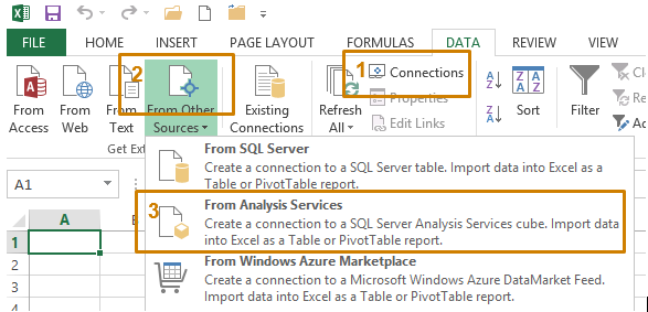
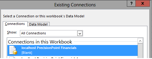
- Create a Connection
- Input the SQL Server Analysis Services server name and credentials click Next.
- Choose your cube and then click Next or Finish.
- Once you do this once, the office data connection (ODC) file will be available on the computer.
- Import data?
- Add a slicer.
- From the Insert ribbon, choose Slicer.

- Make sure to choose the same connection as the pivot table or chart.
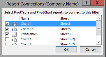
- Once the slicer is added you may notice that, when you click on it, it doesn't change the chart! The next thing to do is to set its report connection. Do this by right-clicking on the slicer and then going to 'Report Connections...'

- From there, choose the appropriate charts and/or pivot tables. (Check out this screenshot "“ who named these anyway)?! Remember to maintain a consistent naming convention to ensure the name is useful and relevant in a production environment!
- At this point, you should a basic report with a slicer and chart. If your slicer is not connected to your chart, you need to make sure that they are using the same data connection and that the report connection is set.
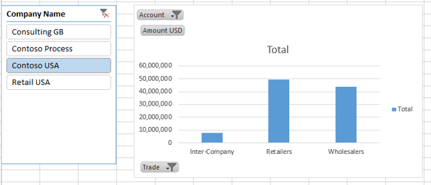
- Add additional charts or pivot tables.
- You can copy/paste a chart to create your next chart and it will inherit the slicer's report connection and all filters you have applied.
- You can also insert new charts and pivot tables from the insert ribbon.
Common Chart Changes:
- For the example dashboard below, an additional chart and a pivot table are needed.
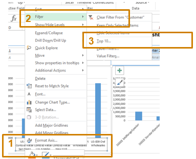
- Expand/Drill down within a hierarchy to see lower levels of detail. Menus are also accessible via right-click
 .
.
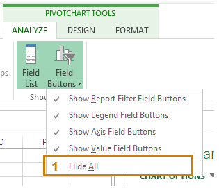
- Hide buttons that are on te chart. Menus are also accessible via right-click.

- Apply a top 'X' filter. The right-mouse menus are contextual so you need to click on the axis (categories) in this example.

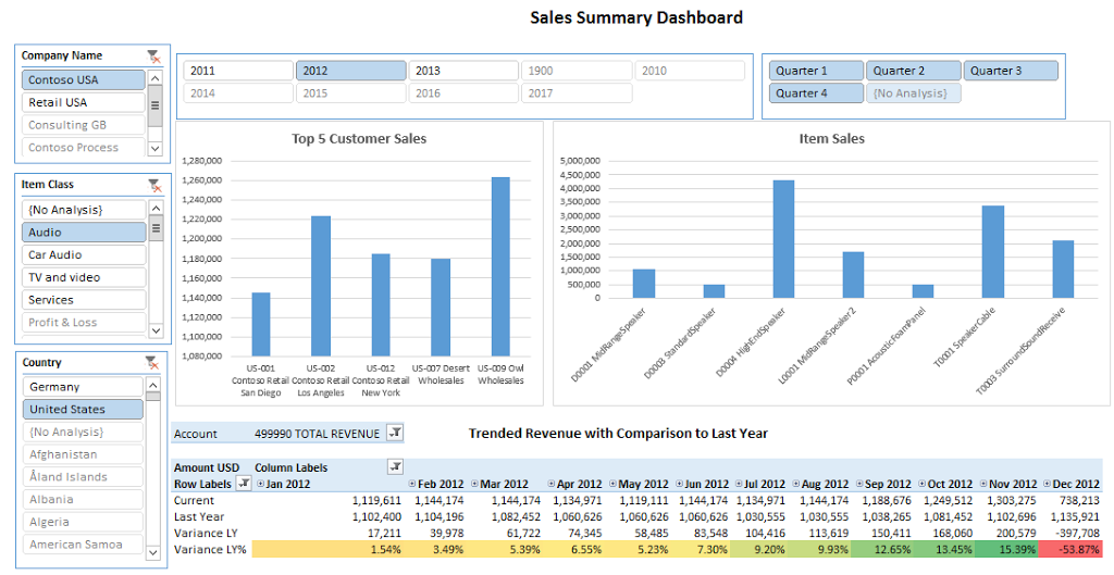
- After applying the chart changes from above and including a pivot table, the final result is below.

A few final thoughts:
- The Top 'X' will only work with a slicer when the slicer and the chart are using different hierarchies/attributes. This means in the screenshot above that 'Item Class' slicer cannot affect "Item Sales" chart AND "Item Sales" returns only the top 5 (i.e. a top 5 filter within the chart itself). There are ways around this, but a change in cube design may be required.
- Any calculations (e.g. Variance LY%) will have to be defined within the cube itself as a calculated member.
- Slicers are very powerful when the data is coming from one cube. However, if you have a common dimension (e.g. AX Company, customer) across cubes (A/R, Sales, Inventory), a single slicer cannot be used.
- Pivot tables are great for ad hoc analysis, but they have severe limitations with formatting.
In my next business intelligence best practices for data cubes post, I will review an Excel add-in that can be used with ANY cube to produce dashboards and boardroom quality reports!
Discover more on best practices for business intelligence.


 .
.